A brand refresh for a trans-tasman tech company.
Cadpro is New Zealand’s leading team of computer-aided design (CAD) and manufacturing (CAM) software experts. Headquartered in Auckland, the business had recently opened a Sydney office and were looking to expand further into the highly-competitive Australian market. However, as a software reseller, Cadpro’s brand had become entwined with a third-party software brand and lacked its own individuality. And despite having a major market share, customers were unaware of the full extent of the business’s capabilites. The goal was to establish Cadpro as its own unique entity and create space for the business to promote its diverse service offering. Branding needed to speak to a wide variety of customers across design, construction and manufacturing industries, while maintaining the brand’s legacy of trust, innovation, and technical expertise.
-
A new, cohesive and scalable brand identity system was designed to allow the business to communicate more impactfully in both digital and physical environments.
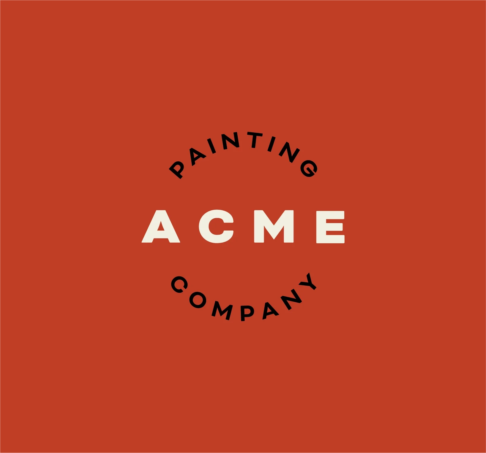
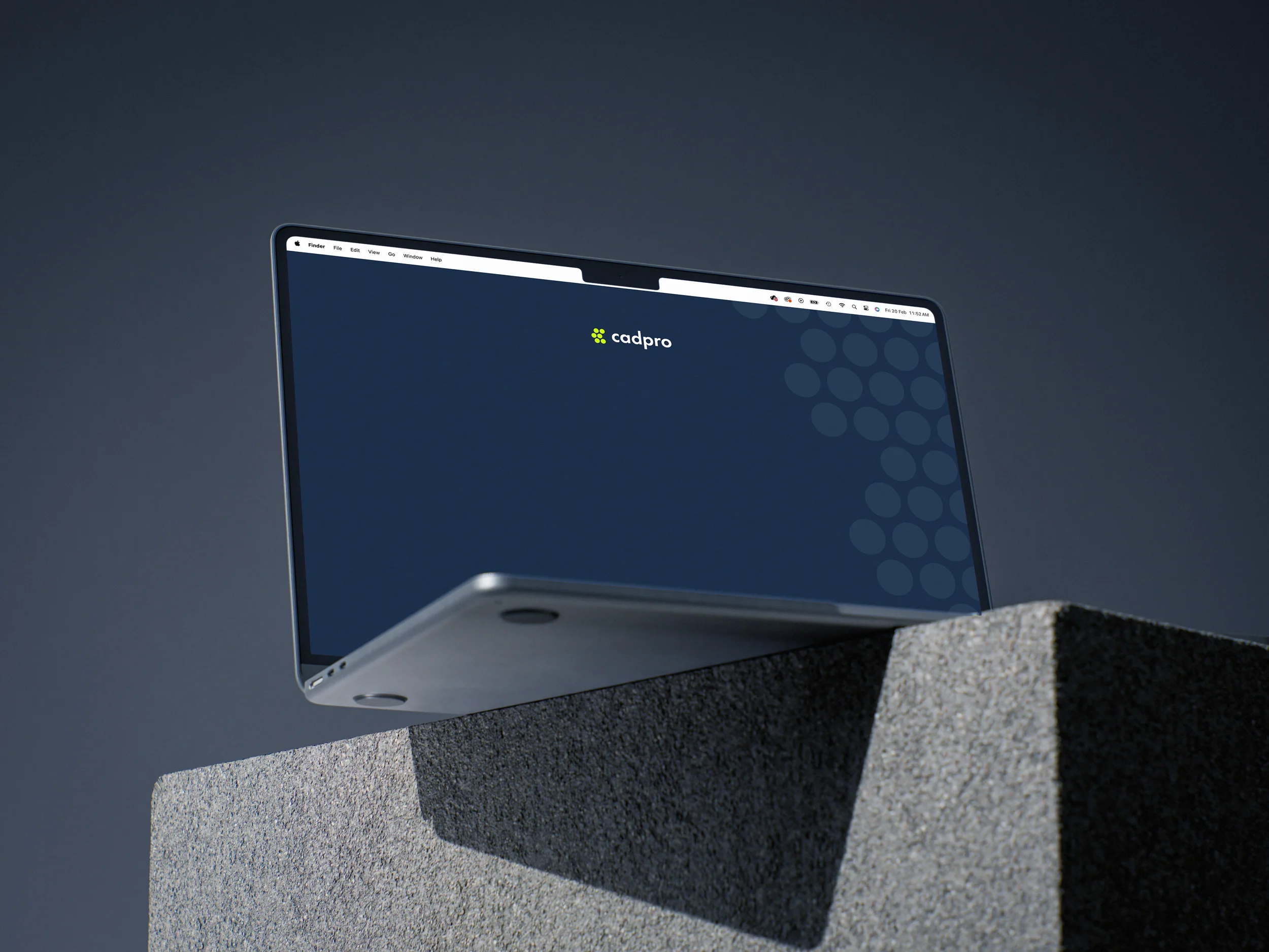
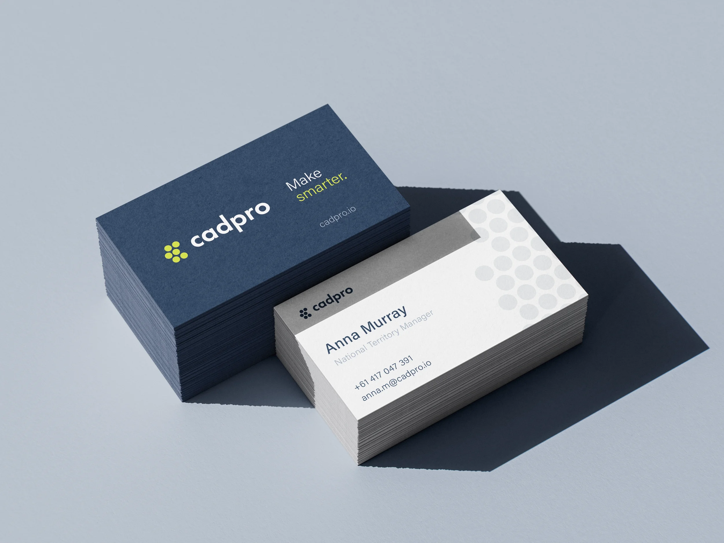
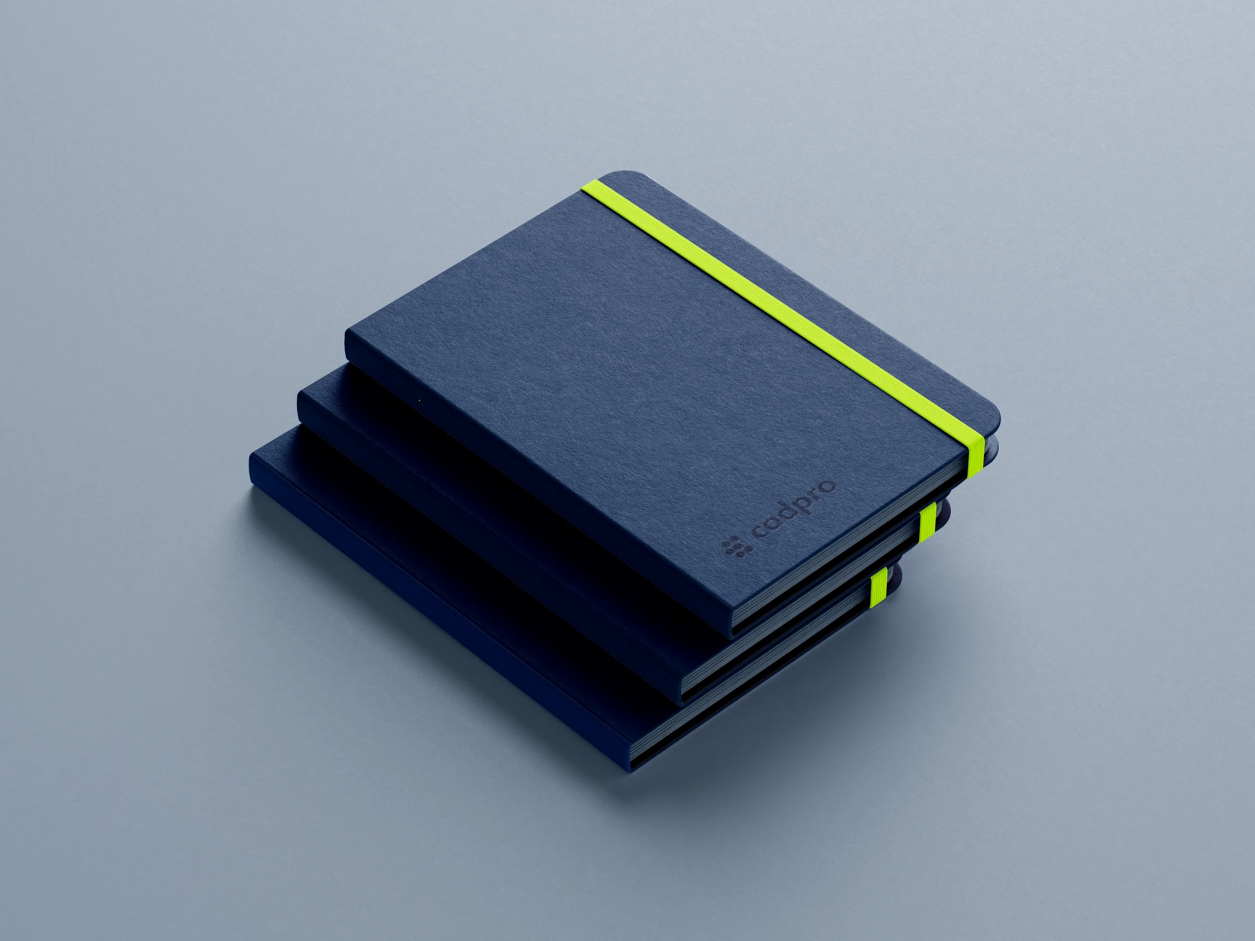
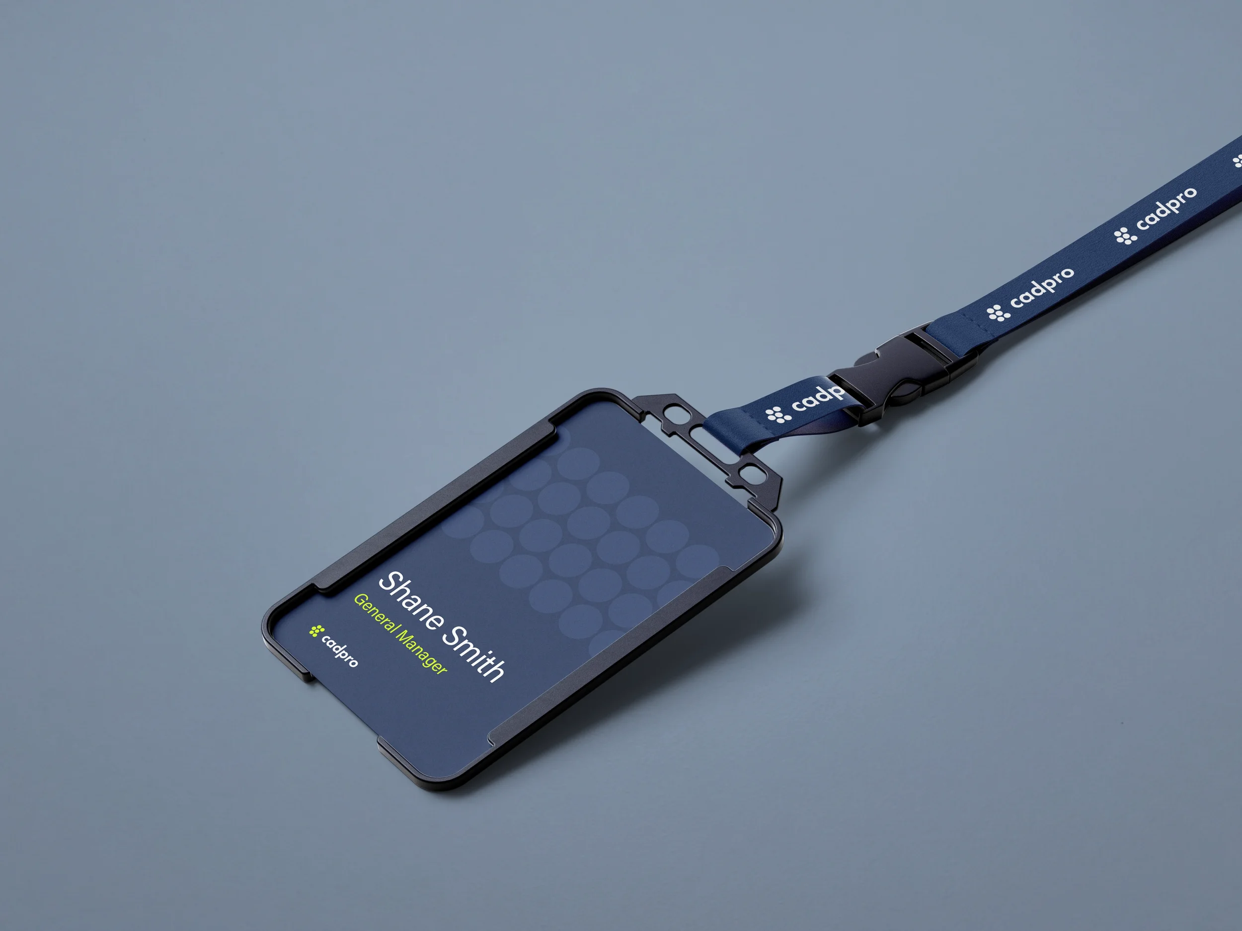
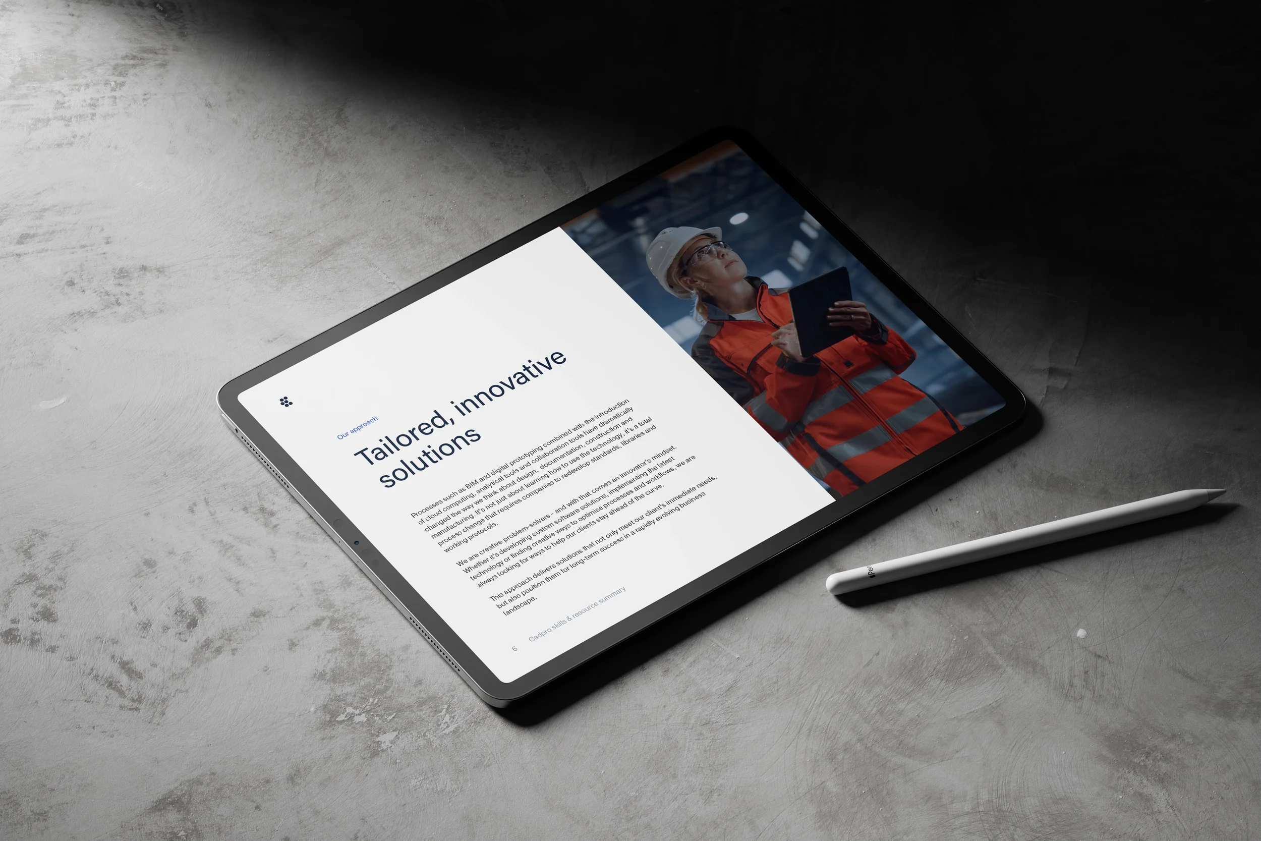
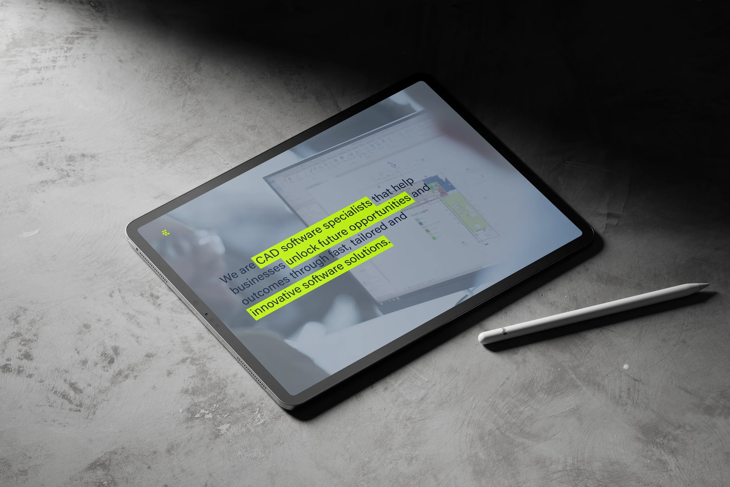
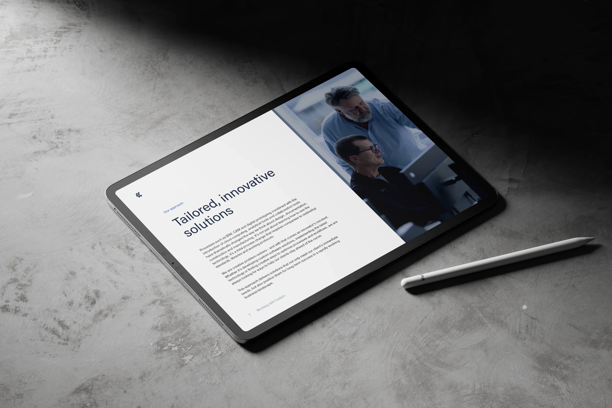
The new Cadpro brand is dynamic, modern and approachable, and this is reflected in both the visual and verbal assets. Colours are high contrast, an authoritative navy and grey punctuated with vibrant accents of neon yellow and cobalt blue. The logo is created using six dots, stacked in a modular arrangement to form the letter ‘C’. Inspired by the idea of ‘joining the dots’, the logo represents Cadpro’s core purpose: connecting people with technology to deliver innovative solutions, every day.
View Services & Deliverables
View Key Outcomes

“Our new brand identity and design system has fundamentally improved our communications and client experience. No. 23 navigated the complexity of our cross-functional teams to align our messaging and design across every touchpoint – sales, marketing, web, social, and even internal documentation. We now have a future-proof brand that reflects our values and the professional standard of the work we do.”
— Shane Beaman, Cadpro General Manager
Services & Deliverables
Brand Analysis
Brand Messaging
Brand Management & Guardianship
Brand Purpose
Brand Story
Brand Strategy
Brand Values
Content Direction
Marketing Strategy
Tone of Voice
Strategy
Animation
App Icon Design
Art Direction
Brand Identity System
Brand Stationery
Brand Merchandise
Colour Palette
Exhibition Design & Signage
Graphic Design
Iconography
Logo and Logotype
Templates — Adobe Creative Suite
Templates — Microsoft Office
Typography
Design
Art Direction
Brand Collateral
Content Production
Copywriting
eBooks
Marketing Campaign Assets
Slide Decks & Presentations
Social Media Assets
Video Editing
White Papers
Website
Content
Key Outcomes
-
A contemporary new brand identity that maintains the company’s reputation.
After years of being synonymous with a third-party software brand, we evolved Cadpro’s visual language into a distinct, proprietary identity. By establishing a professional and cohesive branding system, we moved the business beyond the shadow of a reseller and positioned it as its own unique entity.
Consistency builds recognition, then familiarity, trust, and over time, loyalty. This new level of visual independence ensures that, while the brand’s legacy of technical expertise remains intact, the first impression is now firmly anchored in Cadpro’s own reputation and style
-
Strategic visibility, independence and differentiation.
To address the disconnect between Cadpro’s market share and the awareness of its full capabilities, we developed an identity that highlights exactly what sets the business apart. By distilling their diverse service offering into a unified visual and verbal system, we carved out the space for Cadpro to promote its own innovation. This strategic positioning ensures they are no longer viewed through a simplistic and narrow lens, but as a multi-faceted leader with a distinct competitive advantage.
-
Clarity that anchors strategic decisions to collective company goals.
The new identity serves as a North Star for the Cadpro team; a robust framework for how the company communicates across diverse industries and disciplines, and bridges the gap between New Zealand and Australian offices. As a benchmark for decision-making, Cadpro brand guidelines eliminate the friction often found in multi-departmental structures, anchoring all creative and operational choices to collective company goals. This clarity empowers employees to become ambassadors of the brand’s mission, fostering a stronger, more purpose-driven team.
The result is a more cohesive company culture that remains aligned, even as it scales across borders.