Brand identity design for a professional residential painting company.
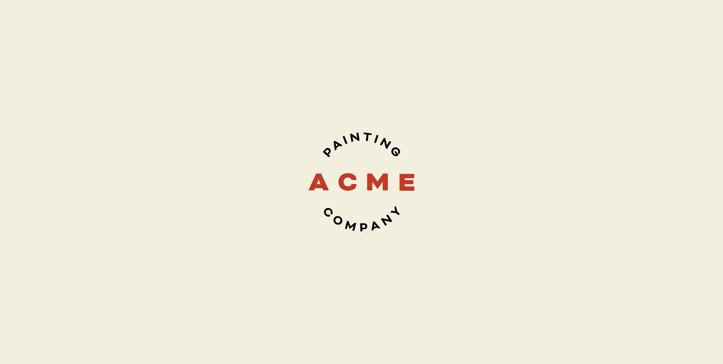
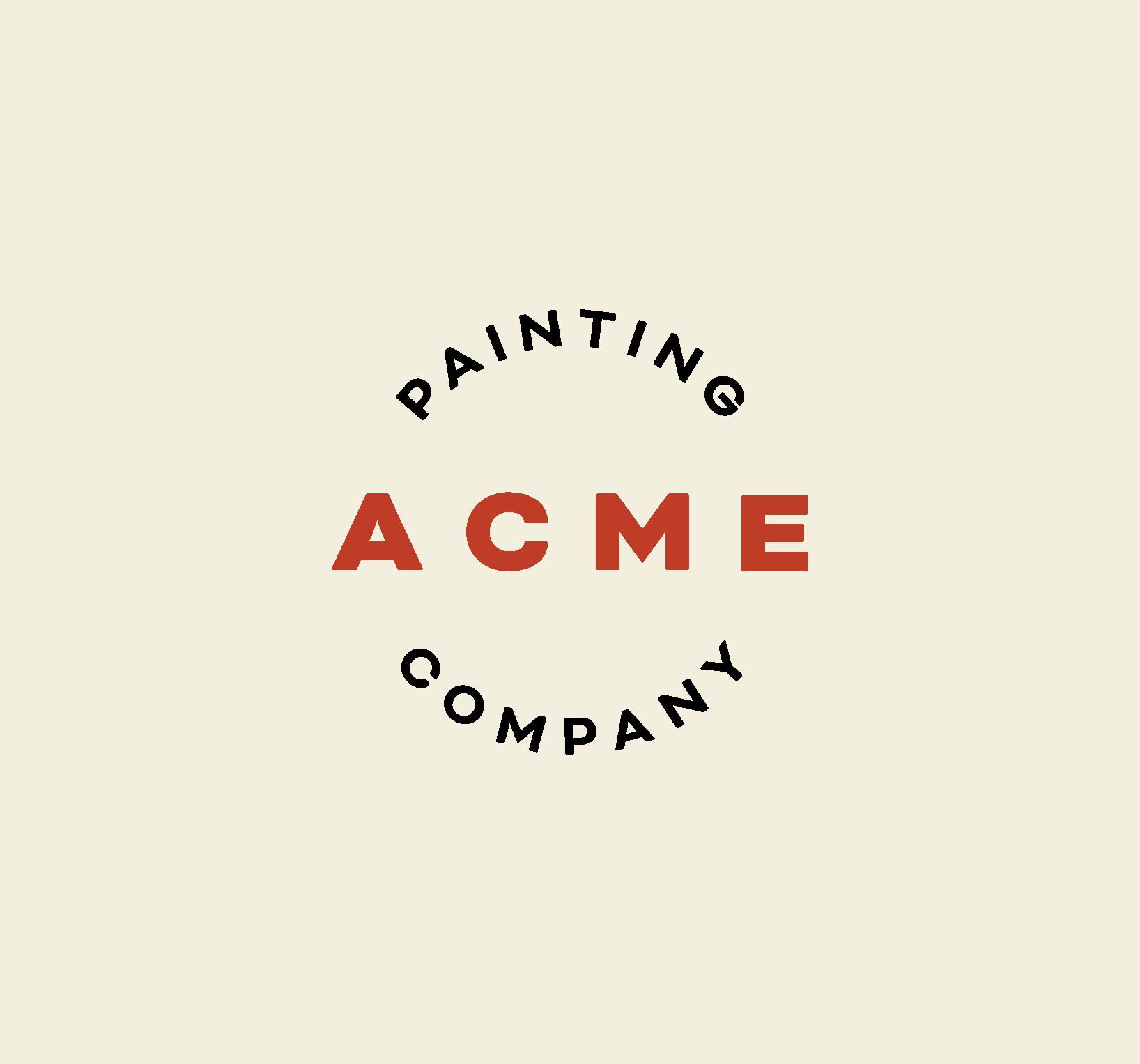
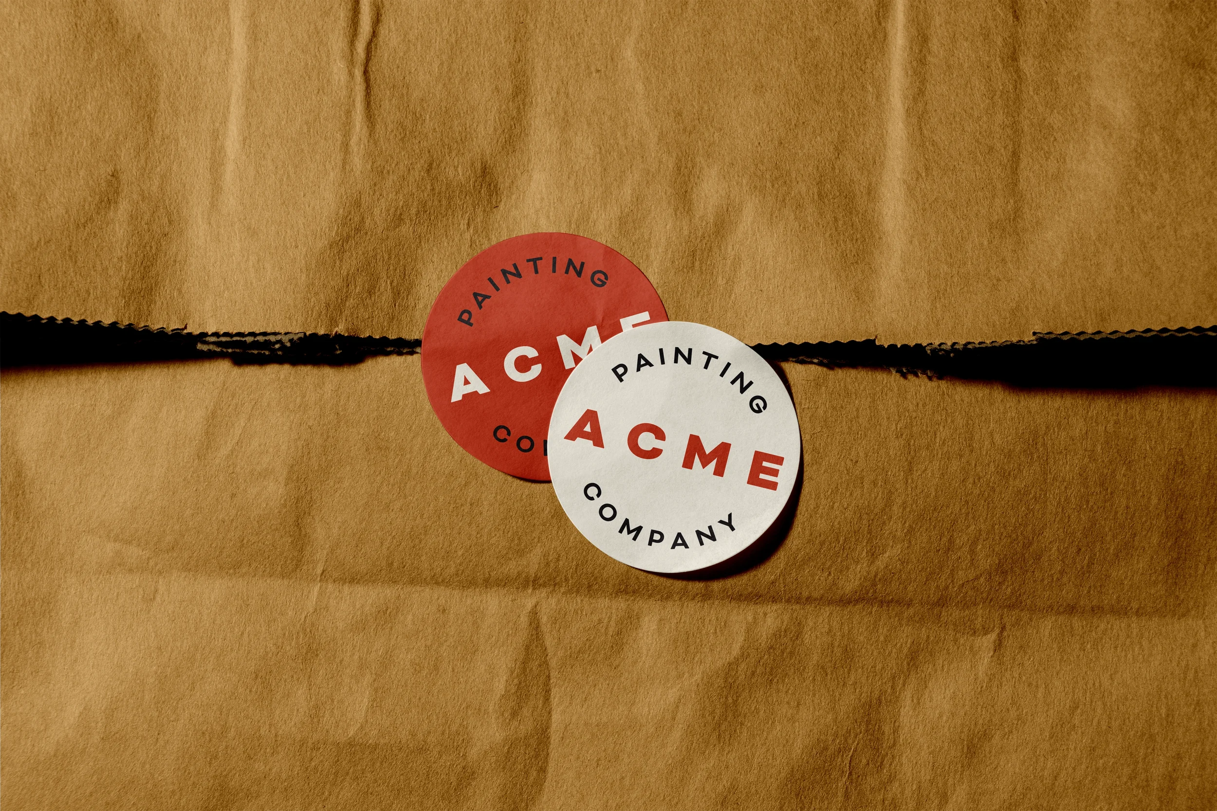
For any service-based trade, one of the biggest barriers is often uncertainty. Customer touchpoints are fleeting; a van, an instagram ad, exterior signage on the job. Defining a clear brand identity for Acme Painting Company would be pivotal: it needed to establish legitimacy and represent quality, alleviating any of the concerns potential new customers may have. The identity for Acme blends elements of traditional craftsmanship and modern precision, drawing inspiration from the heritage feel of mid-century trade emblems.
-
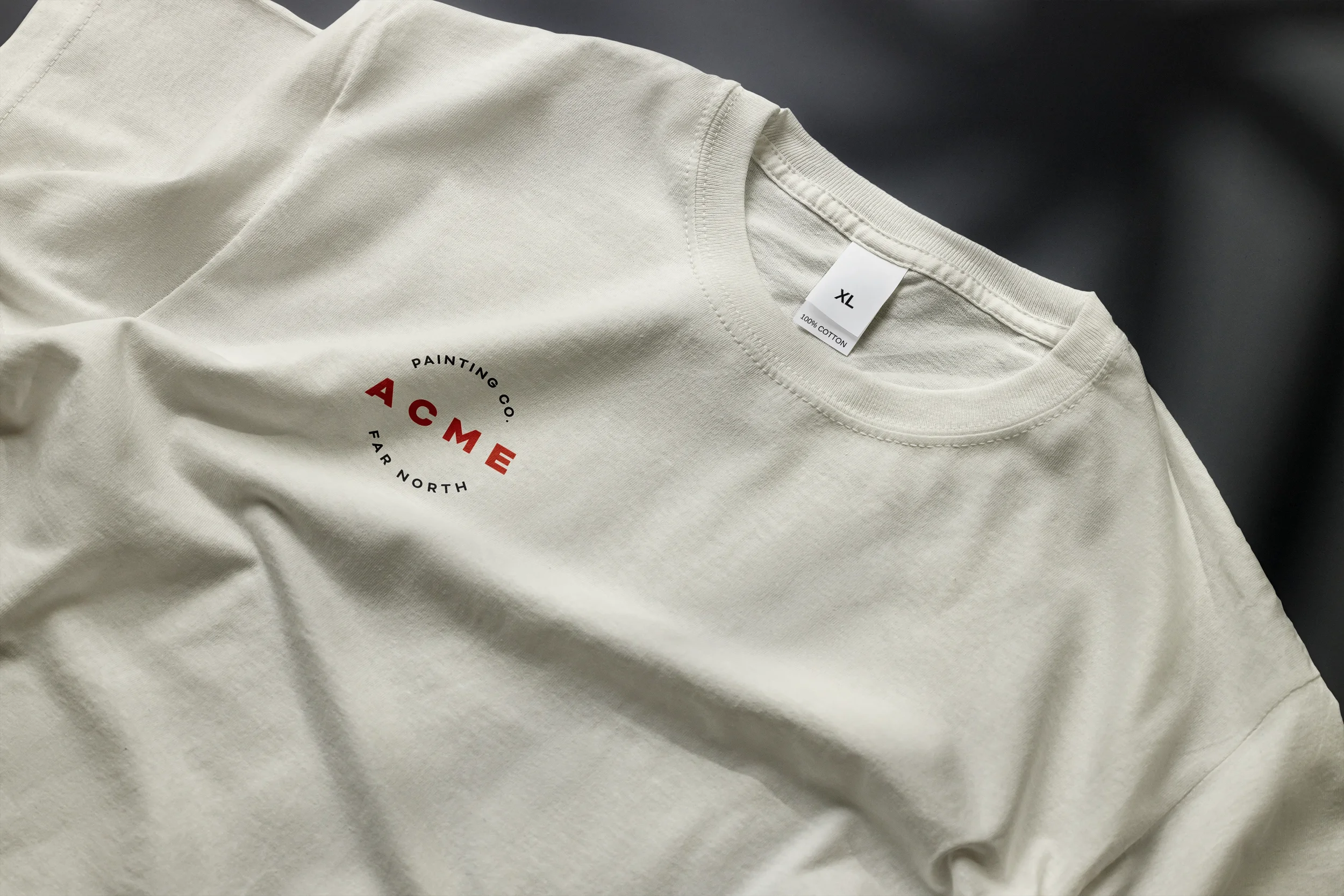
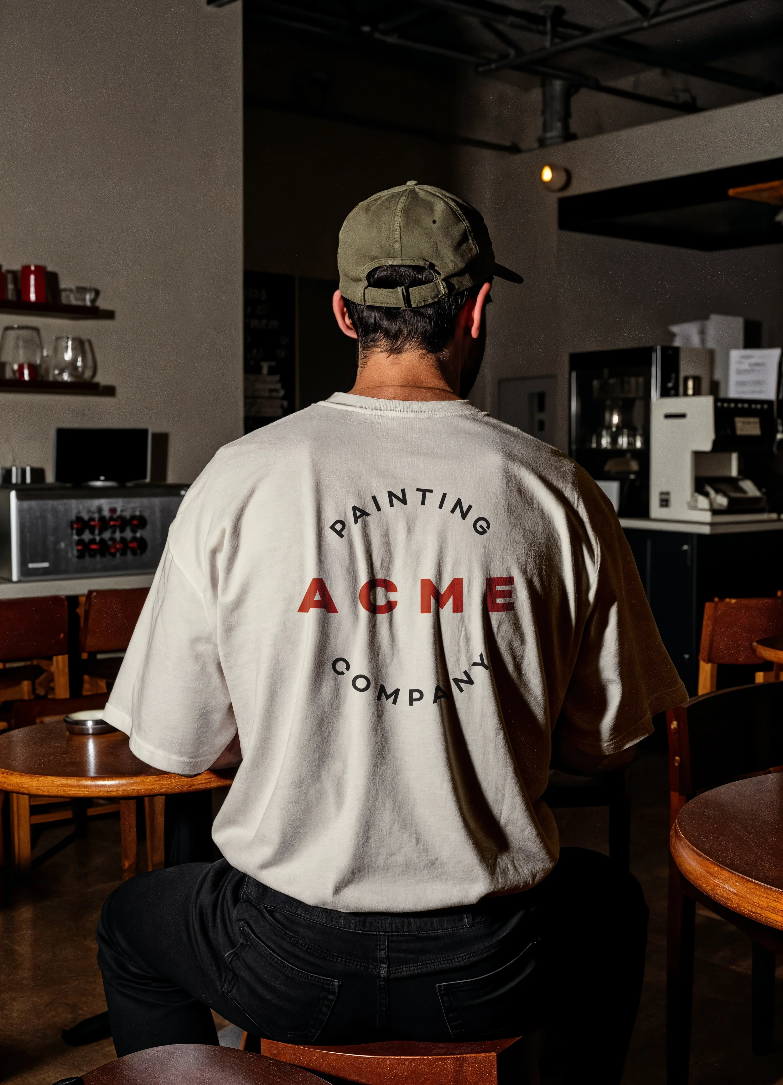
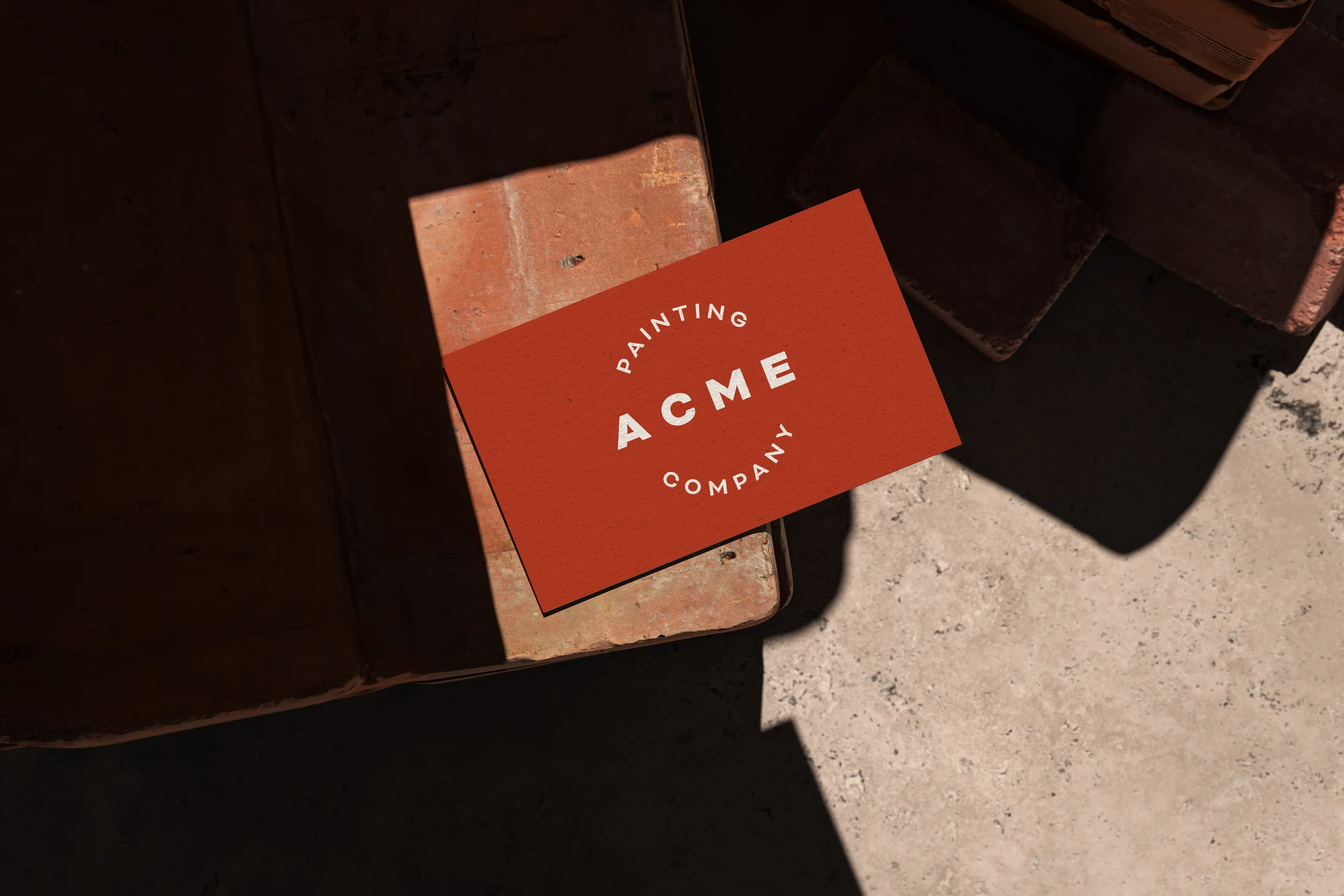
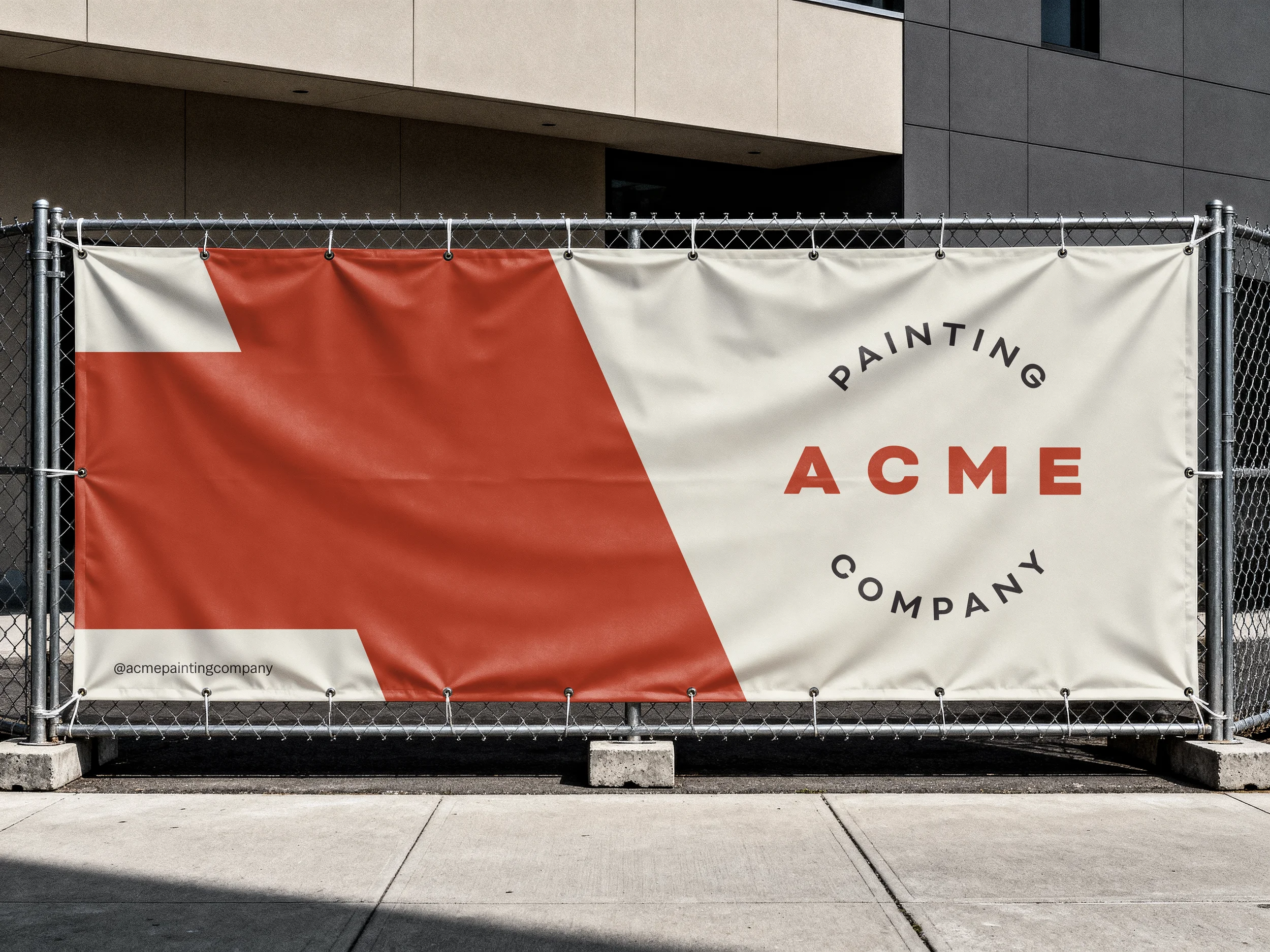
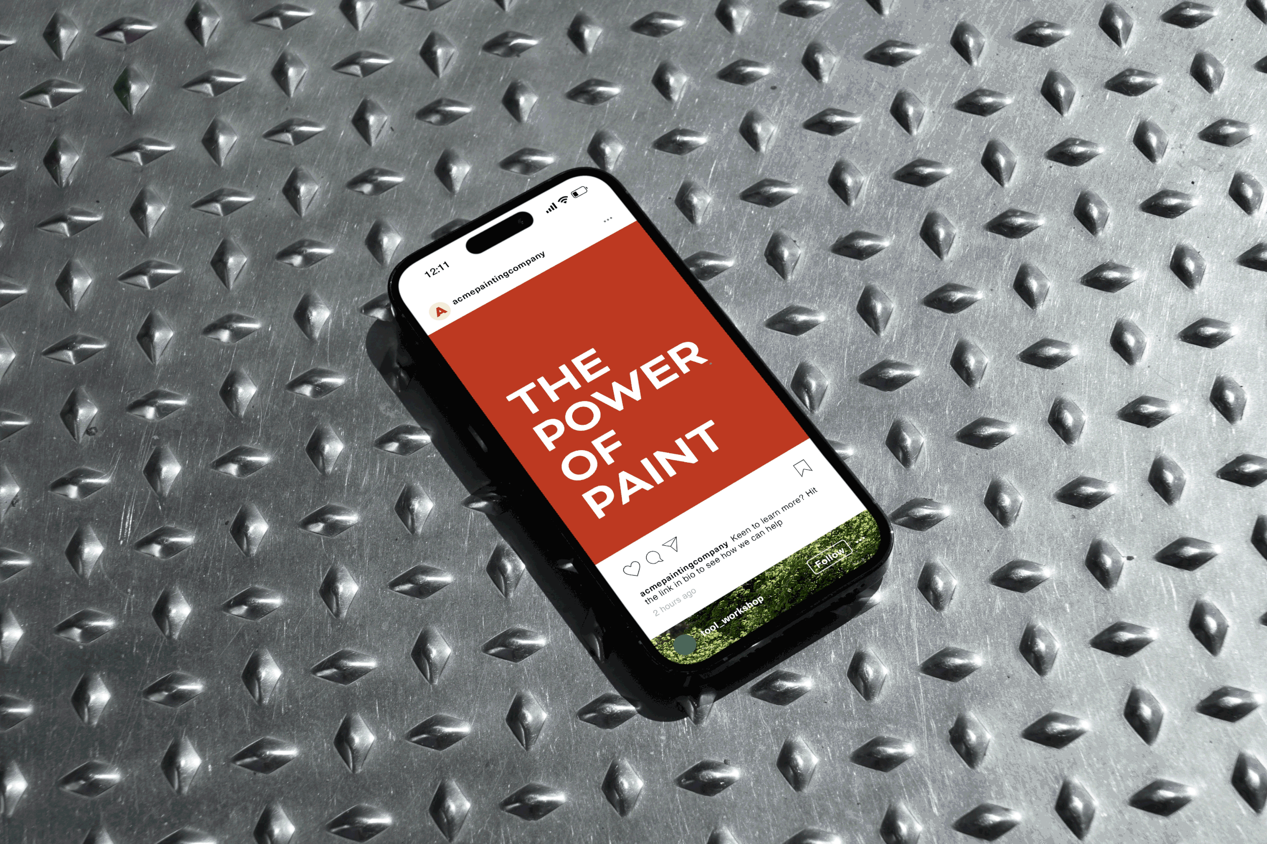
Typography encircles the company name in wide letterforms with exaggerated tracking. A block typeface recalls the strokes of a brush or roller: clean, confident, and professional. The palette of brick red, slate grey and sandstone draws from popular colours of heritage homes across the city.
The result is a brand identity that builds credibility from day one, and a visual framework that scales and adapts consistently – from vehicle wraps to digital marketing – as the business grows.
View Services
View Key Outcomes
“Hattie brought a consultative, professional approach to every stage of the project, with a clear process and open communication throughout. She created a brand that genuinely stands out among our competitors: it’s centred around craftsmanship and quality, with a modern but timeless aesthetic that matched our vision for the business. We’ve now got a really strong foundation we can grow on – and it’s already built trust with clients in our market.”
— Connor Sheehan, owner, Acme Painting Company
Services & Deliverables
Basic Brand Identity
Colour Palette
Favicon
Logo and Logotype
Design
Key Outcomes
-
Professional and cohesive branding that builds credibility and trust.
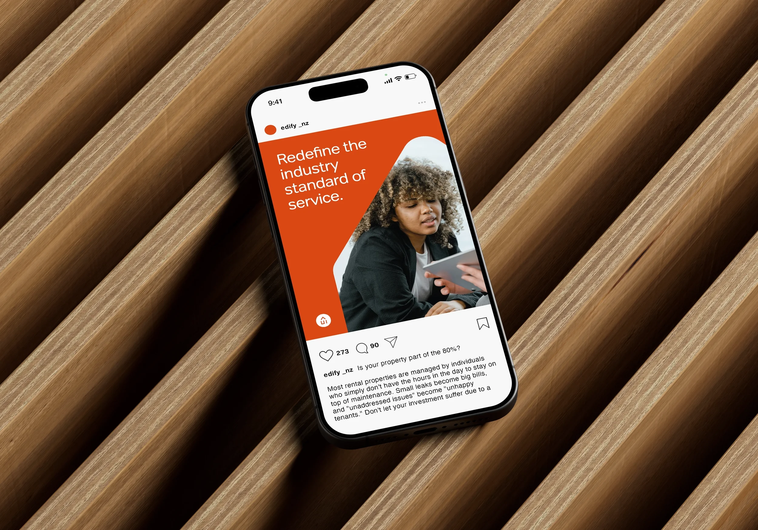
For a service-based business like Acme Painting Company, a professional first impression is the primary driver of trust. We developed a streamlined, functional identity system that signals high-level craftsmanship from the very first touchpoint. By moving beyond the industry standard of uncoordinated marketing, this cohesive foundation builds immediate credibility and reliability in a crowded local market. This system doesn't just look better; it provides a scalable framework that ensures every future asset—from vehicle wraps to digital marketing—remains unified, professional, and distinct from the competition.
-
Amplifying what sets the business apart.
In a highly saturated local trade landscape, we developed a sharp, proprietary visual language to ensure Acme Painting Co. occupies its own distinct space. By distilling their unique value proposition—precision, reliability, and superior finish—into a strategic identity, we can communicate more than just a basic service offering. This careful positioning ensures that when a customer is comparing quotes, Acme is not just an option, but THE option — identified as the most professional, stand-out choice that justifies a premium.
-
A scalable system that supports sustainable business growth.
In the trades, the biggest barrier to a sale is often the friction of uncertainty. By defining a clear brand identity, we’ve removed the hesitancy each new customer may face when trying to figure out if a business is legitimate. A strategic brand acts as a silent salesperson, answering the customer's unspoken questions about quality and reliability before a quote is even requested. This professional infrastructure also creates a simple framwork for growth. Whether Acme is hiring a new crew, wrapping a new van, or expanding into a new suburb, the brand is already doing the heavy lifting—ensuring that every expansion feels like a natural progression of a successful outfit.