Brand identity design for a property services consultancy.
Edify is a property management consultancy founded by industry fixer Erin Kielo — a specialist sought after across New Zealand to coach and support real estate teams. Having worked independently for years, Erin was ready to take the next step: establishing a company with a brand identity polished and professional enough to match her reputation and support her ambitions.
-
No. 23 were enlisted to develop an identity for the brand, including a name, strategy, and select marketing collateral.
The name Edify was chosen with purpose. To edify means to advise, educate, and uplift — directly reflecting Erin's approach to empowering teams with the knowledge and confidence to excel. The word also carries a second layer of meaning, drawn from edifice — a nod to the company's roots in property.
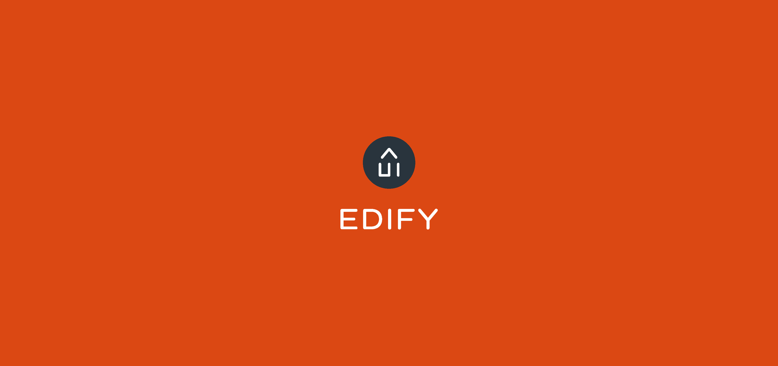
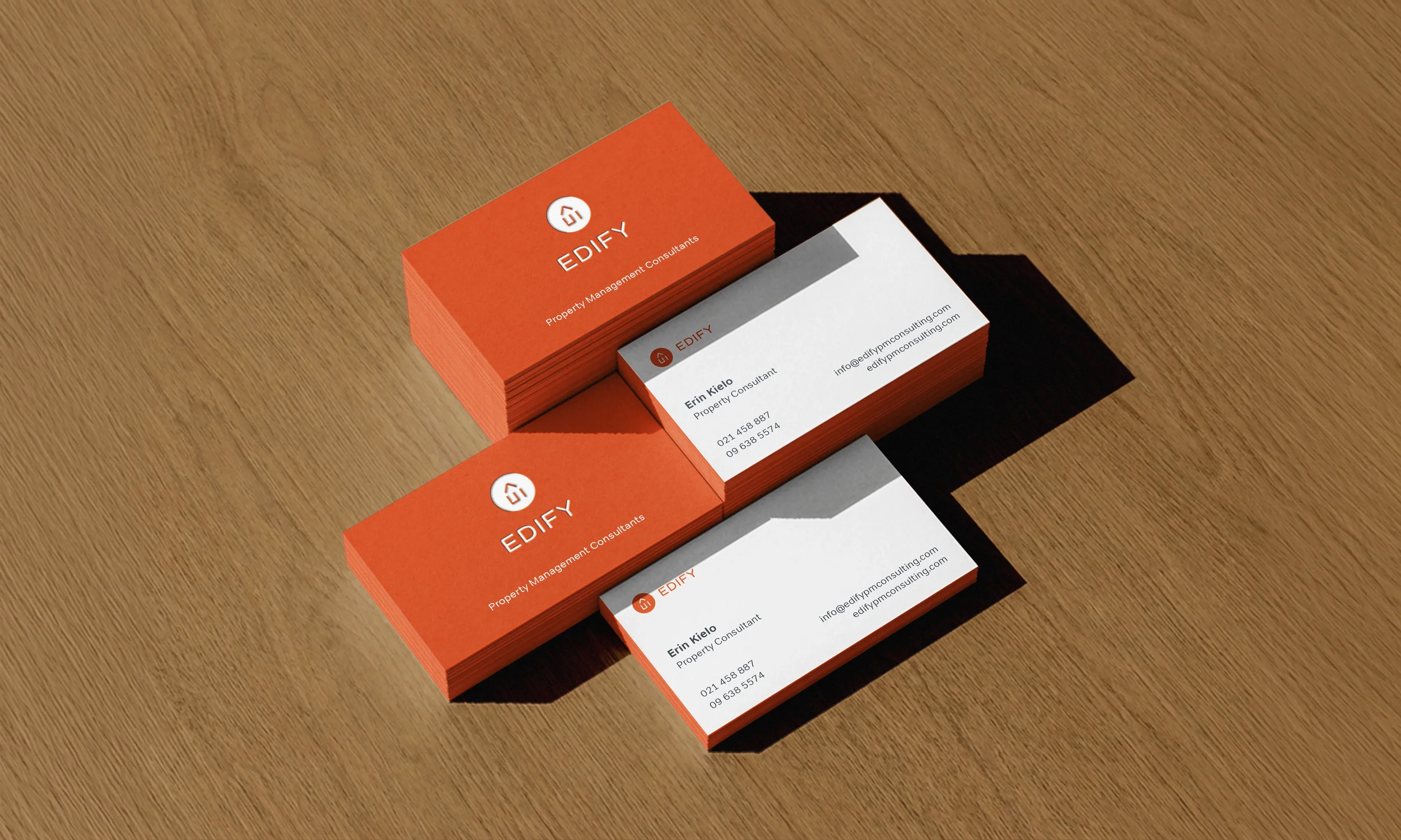
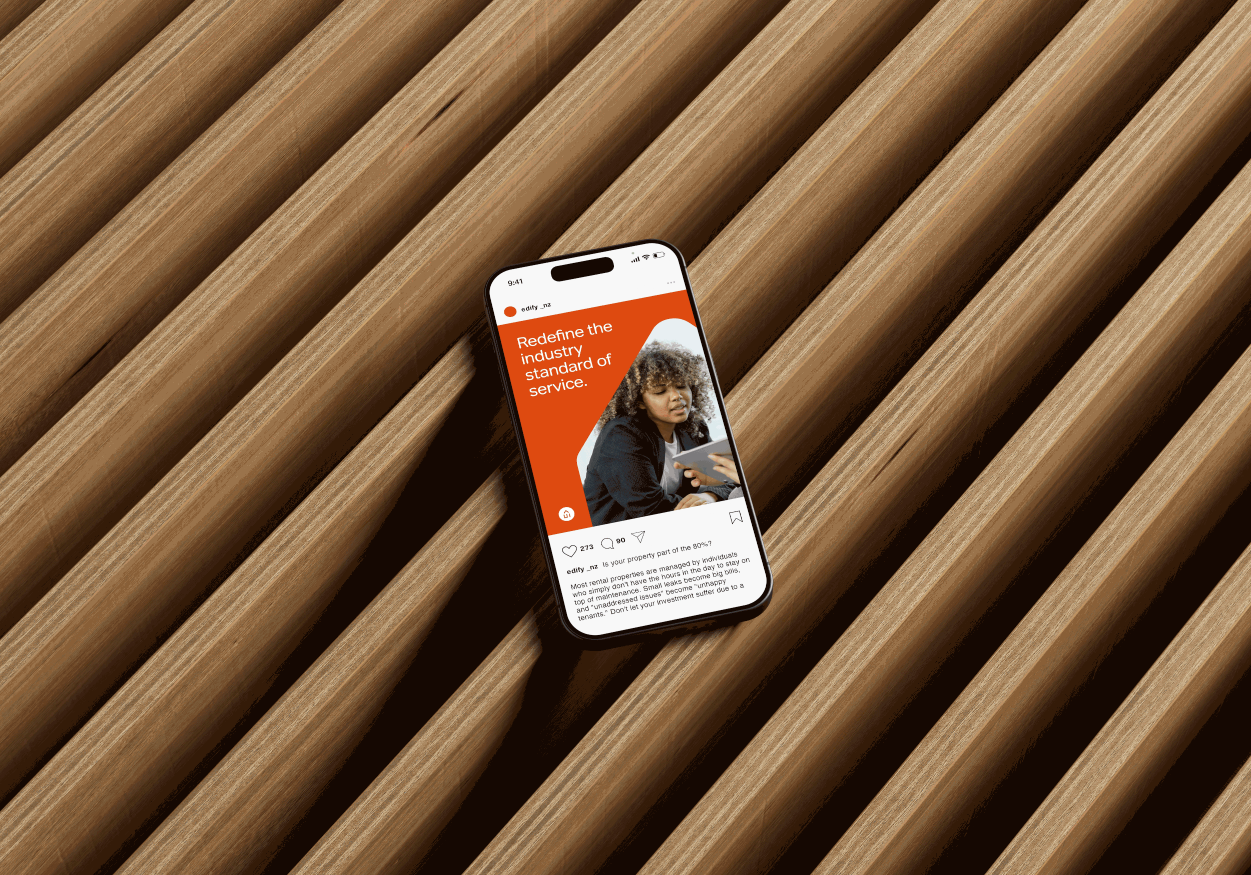
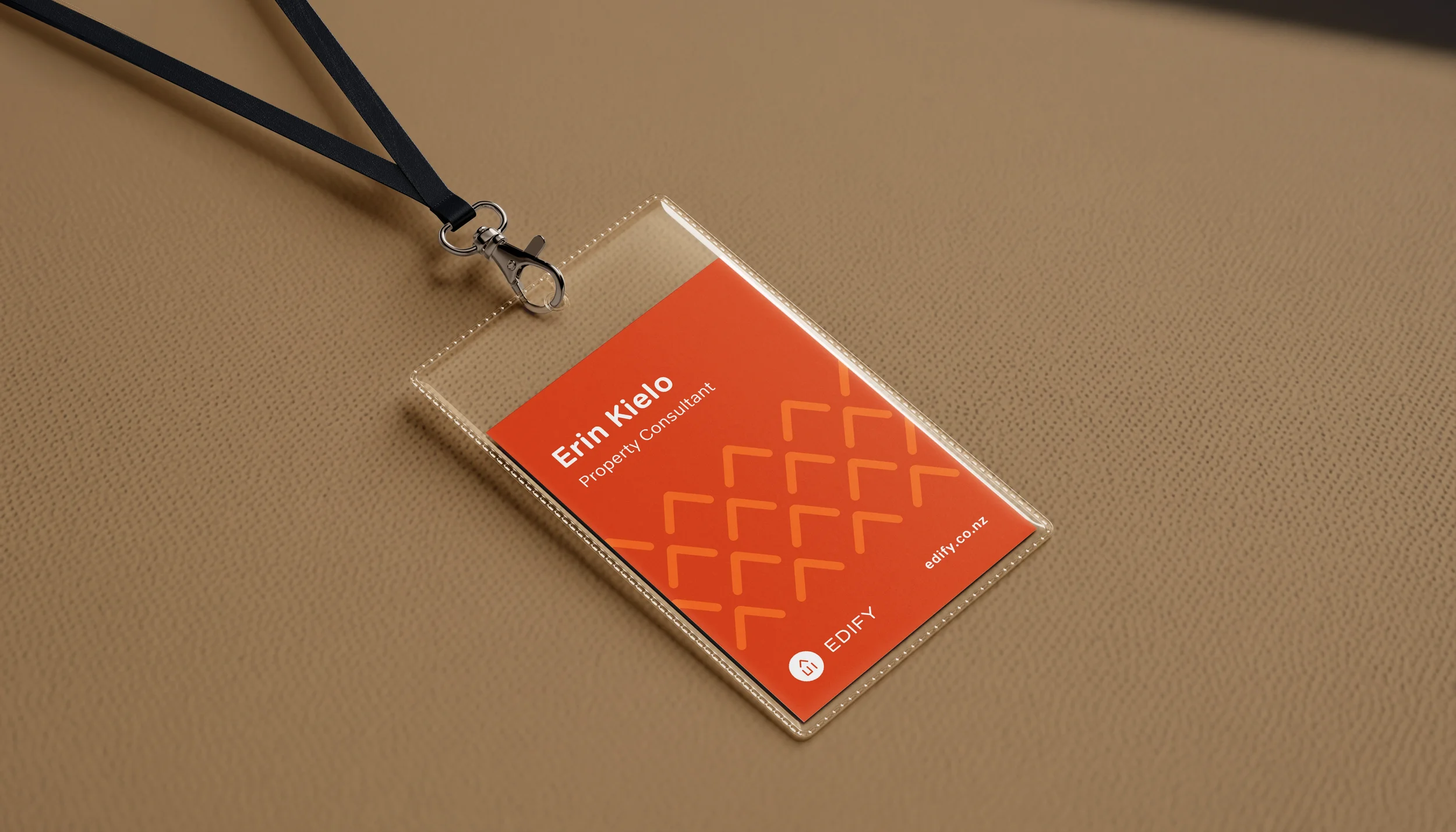
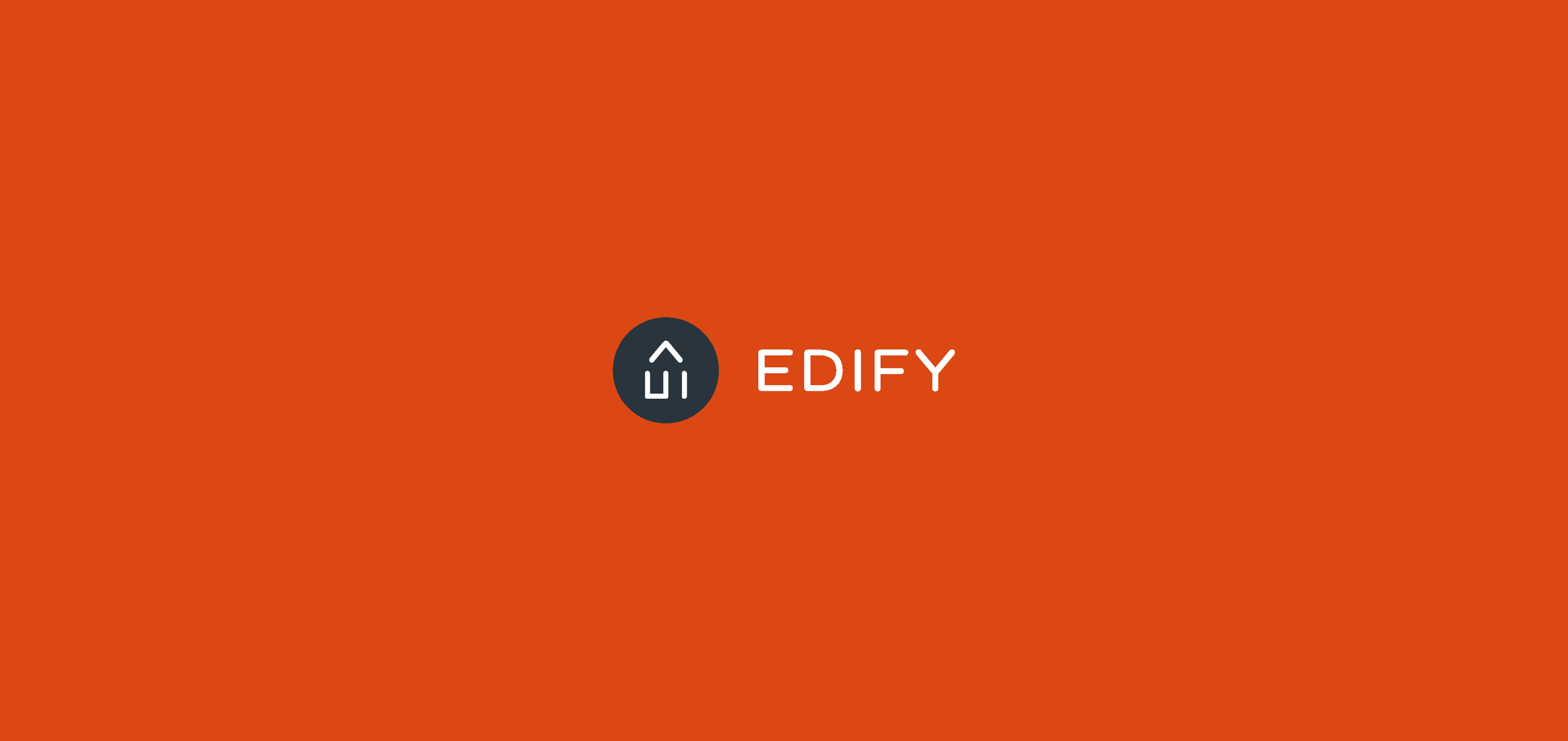
The logo draws from the first and last letterforms of the brand name — E and Y — combining elements of each to create a house-shaped icon. The choice is intentional: the first and last letters imply that Edify takes care of everything from start to finish. AA palette of dark charcoal, bold orange, and crisp white creates a distinctive identity while complementing the brand colours of partner agencies should co-branding be required. The result is professional and polished, with an accessibility that reflects Erin's own approach to her work.
View Services & Deliverables
View Key Outcomes

“The brand is polished, professional and accessible, reflecting the approach Erin takes to her work.”
Services & Deliverables
Brand Analysis
Brand Messaging
Brand Story
Brand Values
Strategy
Brand Identity System
Brand Stationery
Colour Palette
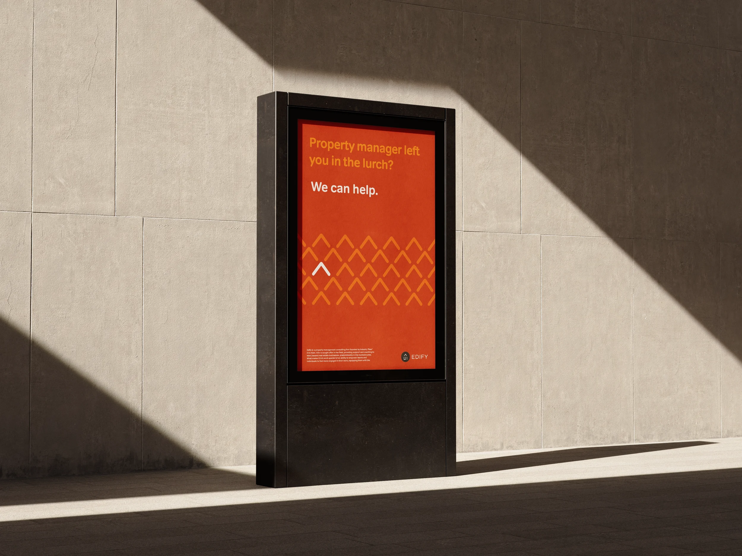
Graphic Design
Iconography
Logo and Logotype
Typography
Design
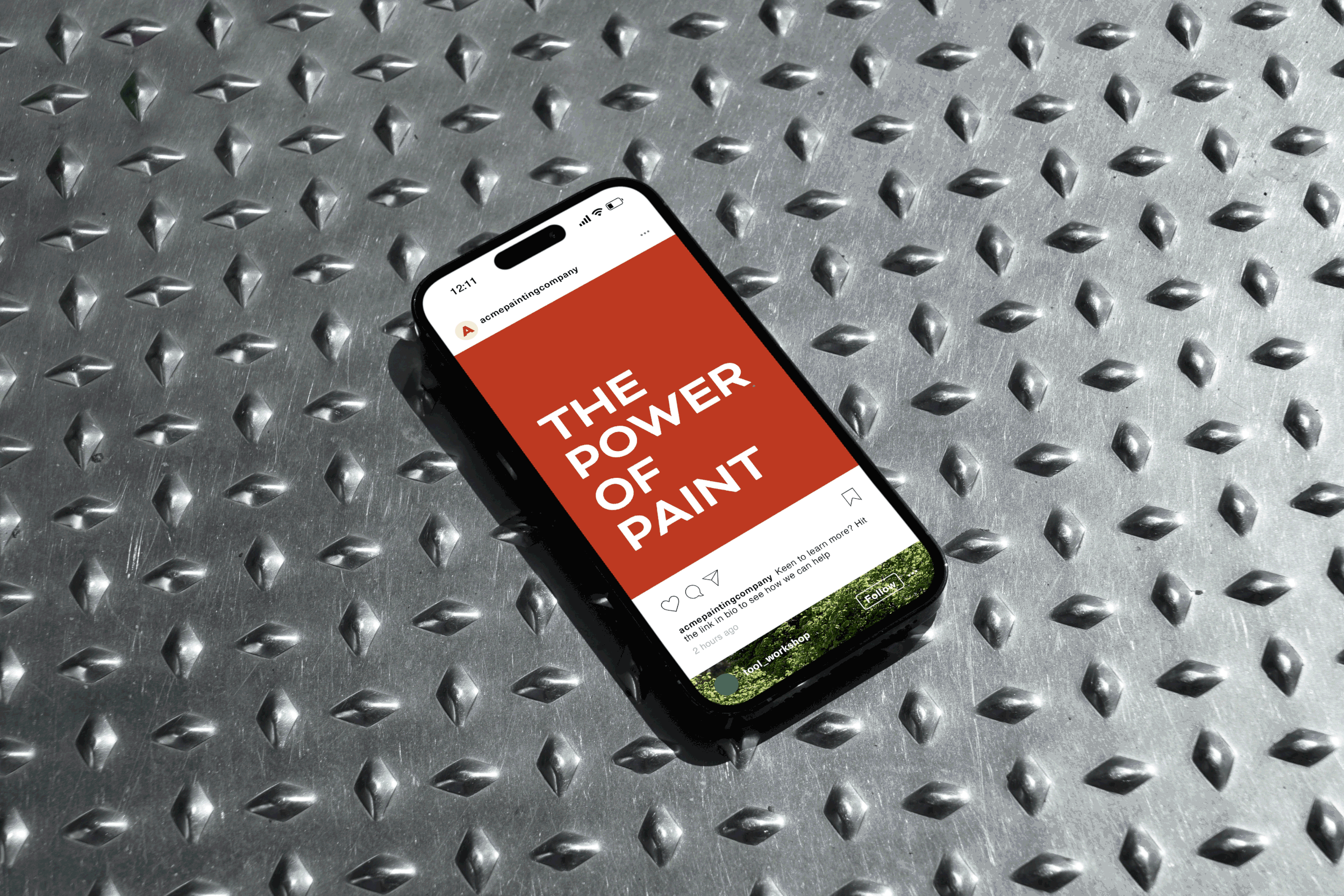
Brand Collateral
Copywriting
Content
Key Outcomes
-
Professional and cohesive branding that builds credibility and trust.
First impressions matter and customers make snap judgements based on what they see. No. 23 developed a comprehensive identity system for Edify that signals established expertise from the first touchpoint. By ensuring every asset—from the name to the digital presence—feels unified and professional, Edify could bypass the new market entrant hurdle, moving the brand immediately into a position of reliability. This cohesive foundation builds the instant credibility required to shift the conversation from "Who are they?" to "How do we start?"
-
Clarifying what sets the business apart.
Launching into a crowded landscape, Edify required a sharp, proprietary visual and verbal language to carve out its own space. We distilled Edify’s unique value proposition into a strategic identity that positioned the brand in the customer’s mind from day one.
-
A strategic filter to align teams and guide decision-making.
As a new organisation, Edify needed a brand framework to provide clarity and guide future growth. The brand identity provides clear guidance on how the company communicates and represents itself, both internally and externally. The new branding creates a strategic filter that anchors all future decision-making to collective company goals. When a brand is clearly defined, teams and customers alike connect more deeply to its purpose, fostering a more cohesive company culture and greater loyalty.