RAY MCVINNIE
Brand and website design for a kiwi chef and food writer.
When esteemed kiwi chef Ray McVinnie was launching a paid subscription platform, he needed something that reflected his food. As an author, food writer and presenter, and now with an engaged following across social media, Ray had earned a decades-long reputation for failsafe dishes that deliver on flavour. Simple and delicious home cooking, rooted in classic methods, but with an original point of view.
Ray’s goal was to build a community of confident home cooks with a member’s site, packed full of weekly recipes, videos, and personalised guidance. A website with temporary branding was already operational, but it lacked the vibrant, approachable quality so characteristic of his food. He needed a simple brand identity to design, scale and promote the paid platform — a brand that could help develop the business behind the cook.
-
With a large digital audience and a significant following from his print and TV days, the design needed to appeal across demographics. The brand had to feel vibrant, effortless and modern — much like his food — while adapting across digital contexts.
"The outcome surpassed expectations," says Grace McVinnie. "Hattie at No. 23 helped us clarify what we wanted for the brand and distilled it into a beautiful design system and web experience."
Classic serif type lends timeless credibility, reminiscent of the magazines and newspapers where Ray built his original audience, creating familiarity and trust among subscribers. But the bright, saturated colour palette keeps things modern, directly inspired by fresh ingredients — verdant spinach, peppery olive oil, dark chocolate and milky cream. The R. favicon features an offset dot tucked neatly into the curves of the R — simple enough, but on closer inspection, you'll see a subtle nod to the signature eyebrow raise that ends all his videos.
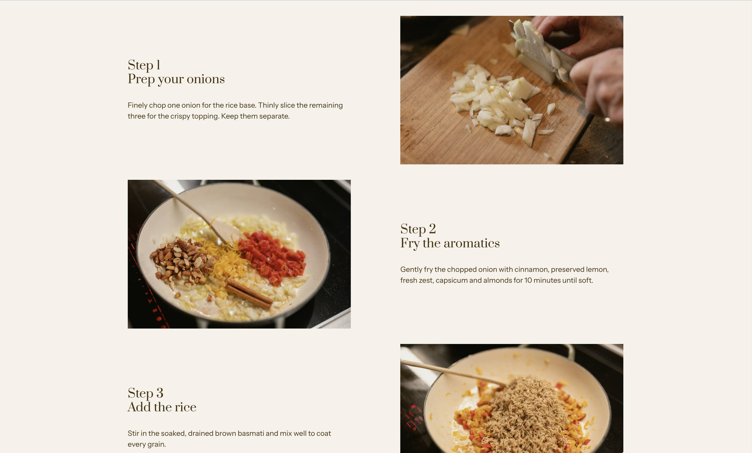
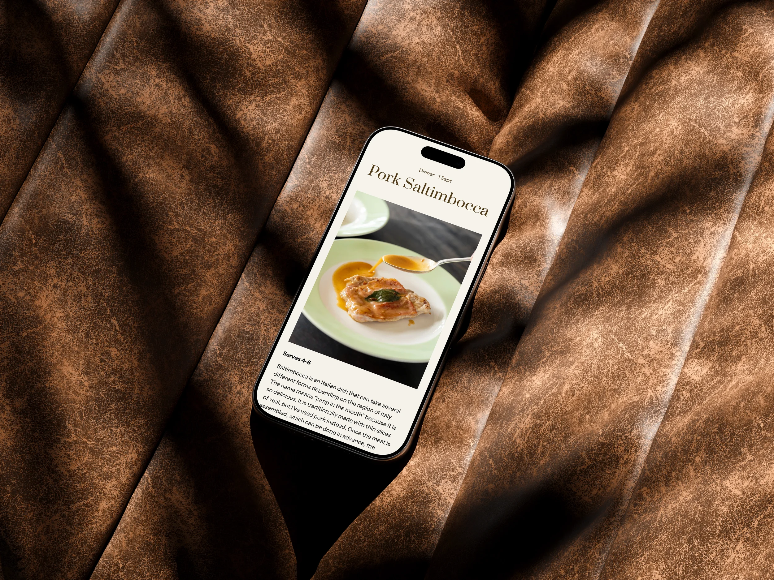
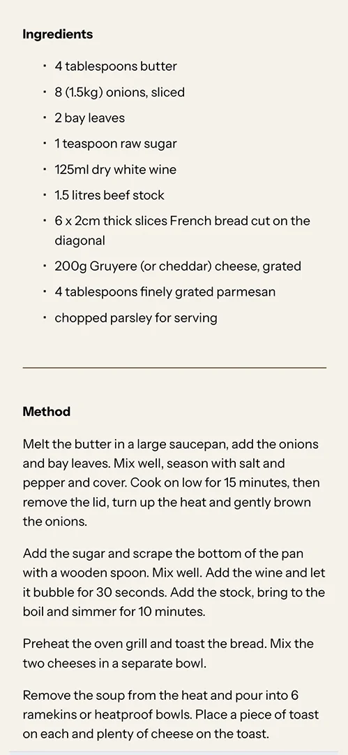
The site had to be simple to update (for Ray) and navigate (for users), working within the confines of Squarespace, but without feeling like a bland Squarespace website. We added video and subtle animation to add movement and interest. We also consolidated all recipes into a single location, cleaned up and streamlined tags and categories, and created templates for simple and complex dishes.
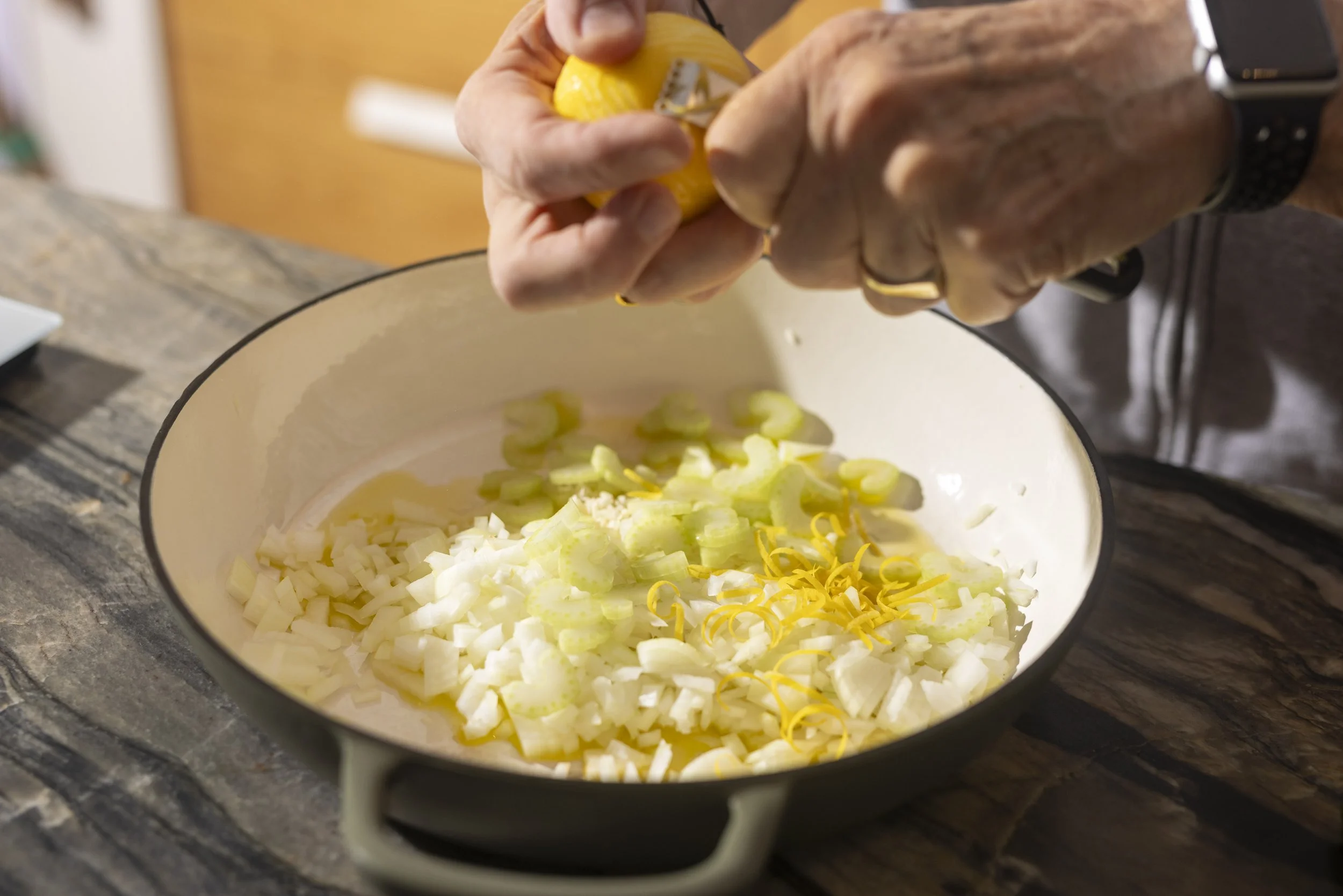
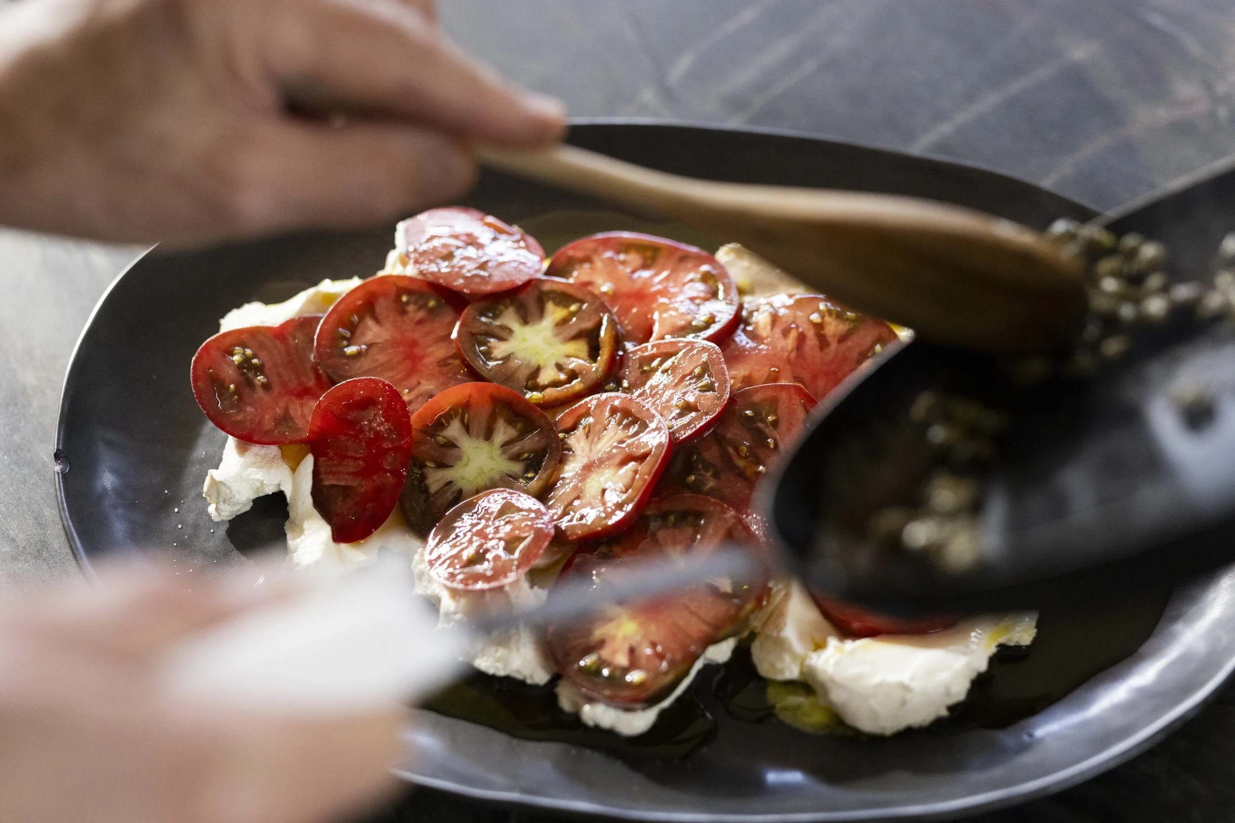
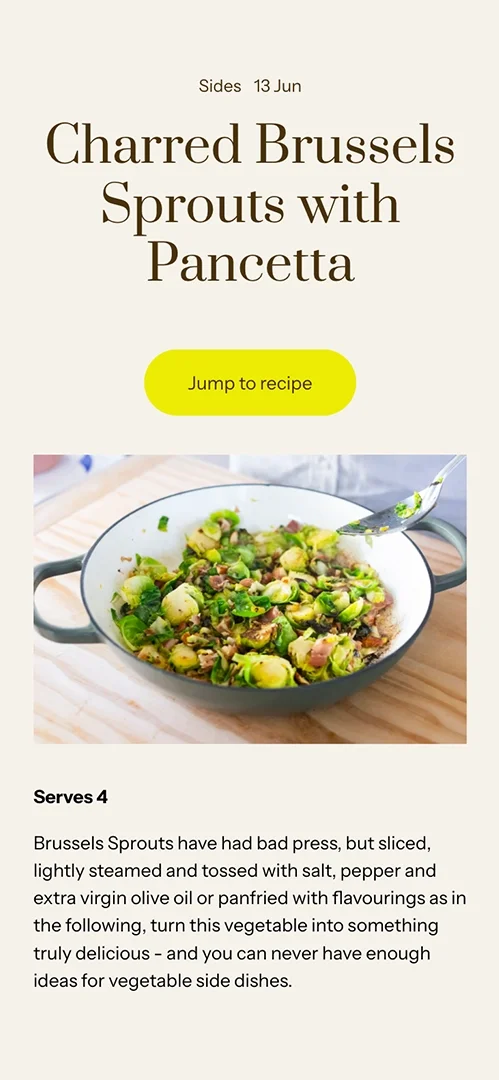
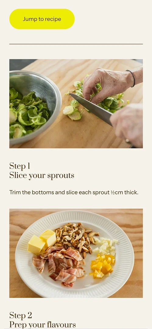
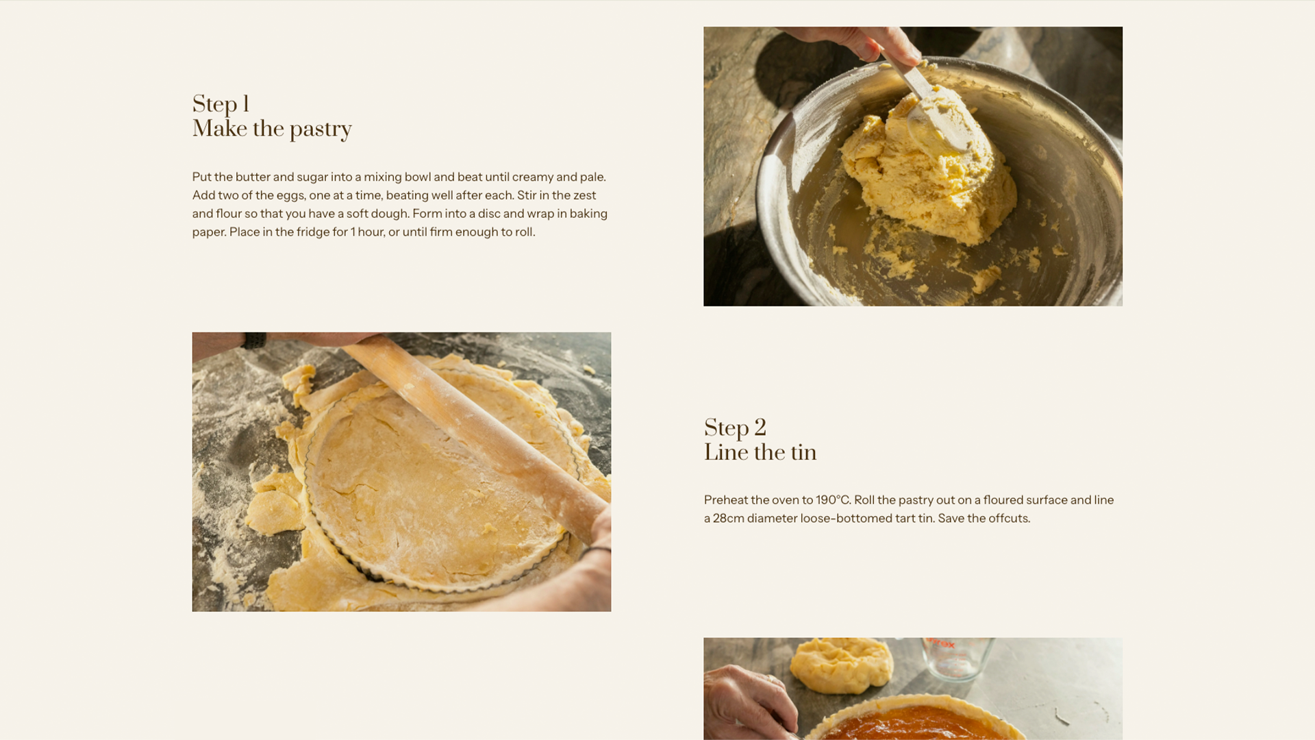
The homepage was enriched with more categories and ideas to entice and guide cooks fatigued by dinner-making decisions. Modules like 'Tip of the Week' and 'Ask Ray' created opportunities to impart knowledge and improve retention. The copy became more active to engage potential subscribers, and a new tag index page let subscribers easily navigate and search recipe categories. Rather than a traditional approach that focuses on the finished plated dishes, we led with photography showing the process, making subscribers feel like they were watching over Ray's shoulder and emphasising the personal guidance he provides.
"In the first month, we saw our bounce rate drop, page views increase, and conversion rate double," says McVinnie.
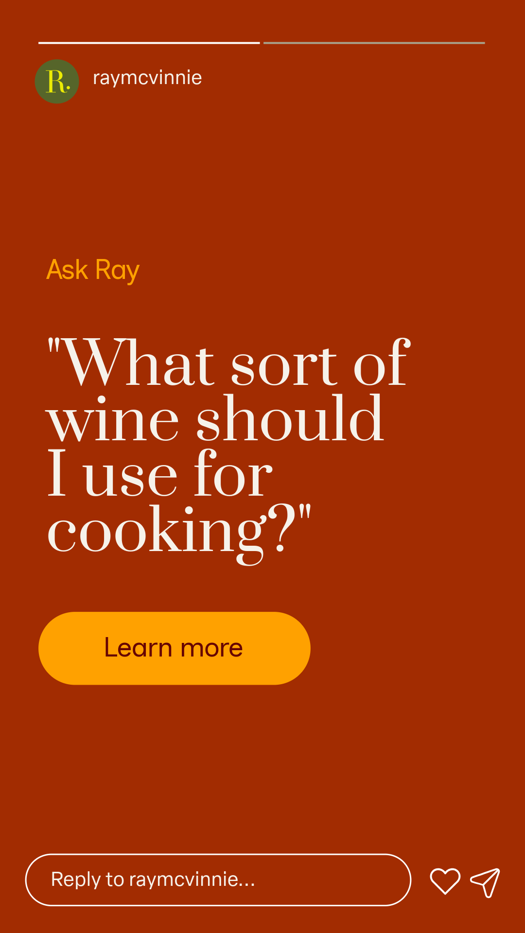
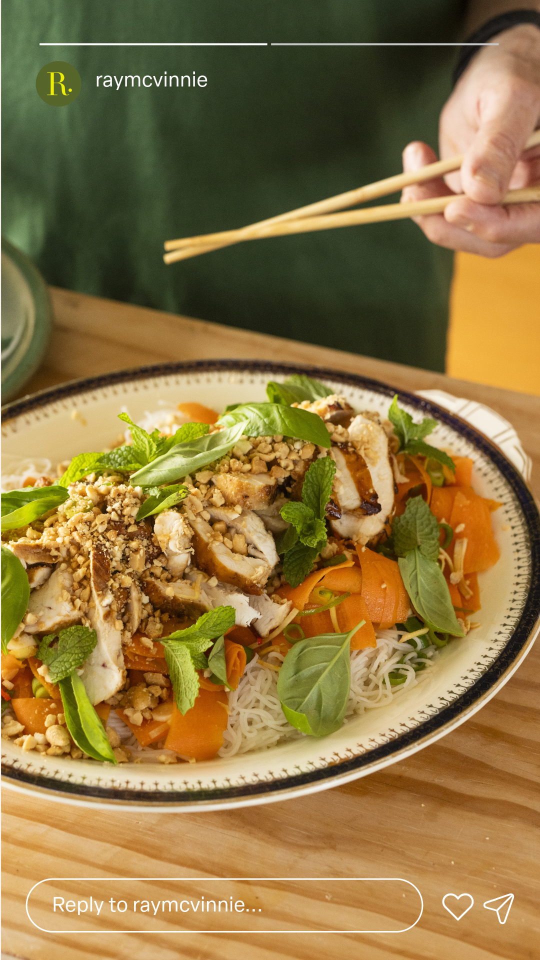
We translated the site design into templates for Instagram, keeping the brand consistent across touchpoints and creating an ownable, recognisable identity that elevates his content beyond Instagram's native styling tools.
"The expertise, thinking and creativity Hattie brings to every project always impresses us. Thank you, No. 23, for the outstanding work, as always."
All photography and video by Alex McVinnie.

“In the first month, we saw our bounce rate drop, page views increase, and conversion rate double.”
“We've worked with Hattie for over seven years, and the expertise, thinking and creativity she brings to every project always impresses us. No.23 recently refreshed our family business's brand and website, and the outcome surpassed expectations. Hattie helped us clarify what we wanted for the brand and distilled it into a beautiful design system and web experience. She also provided practical and flexible templates that have allowed us to easily adopt and implement new styling across social, email and other channels. Engagement was one of the goals of our new website, and in the first month, we saw our bounce rate drop, page views increase, and conversion rate double. Thank you, No.23, for the outstanding work, as always.”
— Grace McVinnie, Marketing Manager, Ray McVinnie
Services & Deliverables
Brand Analysis
Brand Messaging
Tone of Voice
Strategy
Animation
Brand Identity System
Colour Palette
Graphic Design
Logo
Templates — Canva
Typography
Website
Design
Copywriting
Social Media Assets
Website
Content
Key Outcomes
-
Web design that delivers commercial value.
Bounce rate dropped, page views rose, and conversion rate doubled in the month after launch — early proof the new brand and website design were doing their job, not just looking good.
For a subscription platform, that shift demonstrates commercial value beyond an updated aesthetic. It shows the UI/UX (user interface and user experience) is improving how people engage with the site: staying longer, exploring more, and converting into paying members at twice the previous rate.
-
Turning disparate content into an organised reference tool.
Ray's back catalogue had grown organically over the years, spreading across categories and tags until the structure became unwieldy. We cleaned up the tagging structure and introduced a taxonomy — standardised categories that group similar recipes together and improve the site's usability.
A tag index page lets users browse and discover every recipe, grouped logically by the new taxonomy.
Previously, written and video recipes lived in separate places. We consolidated every recipe into a single, easily navigable location.
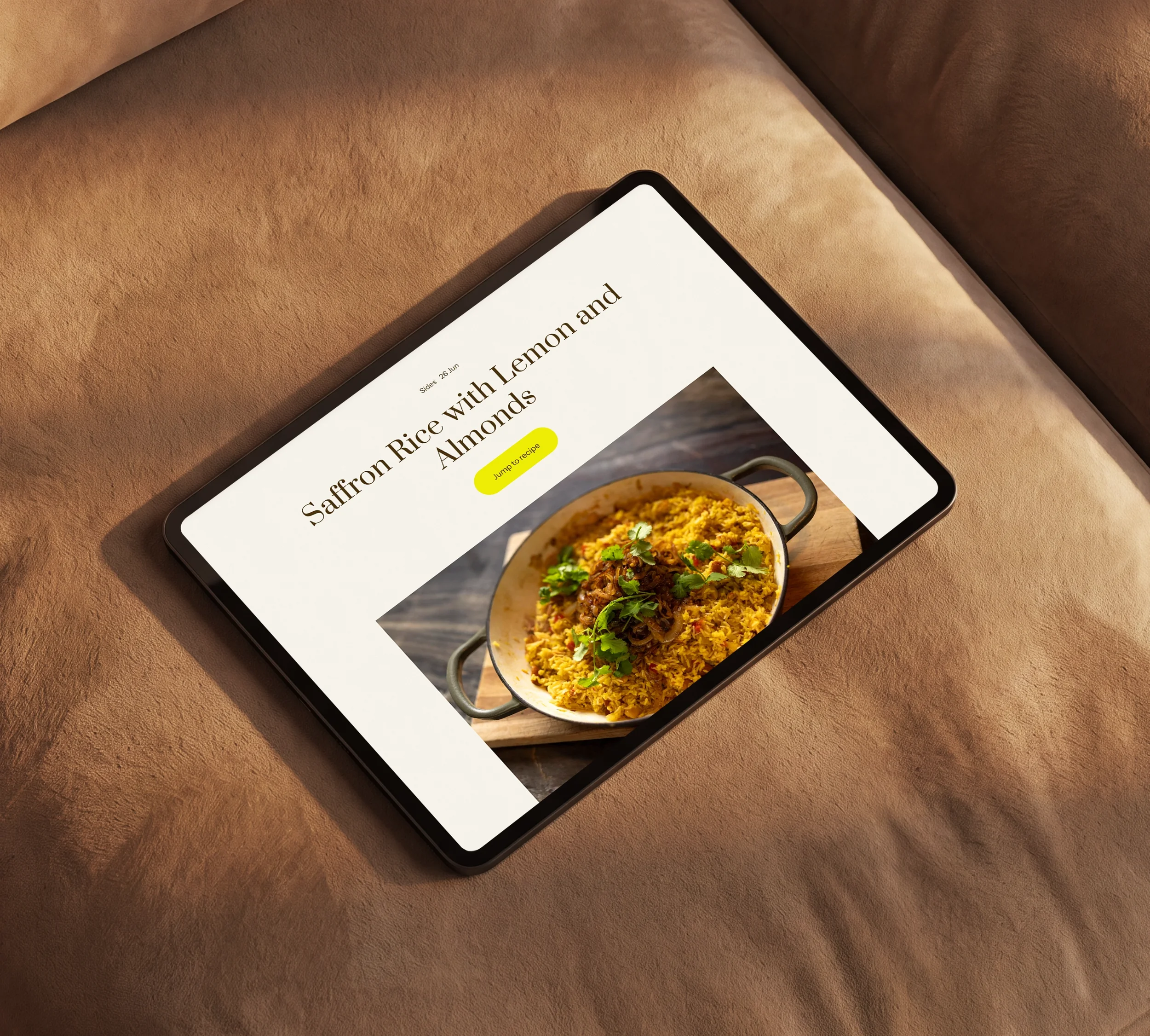
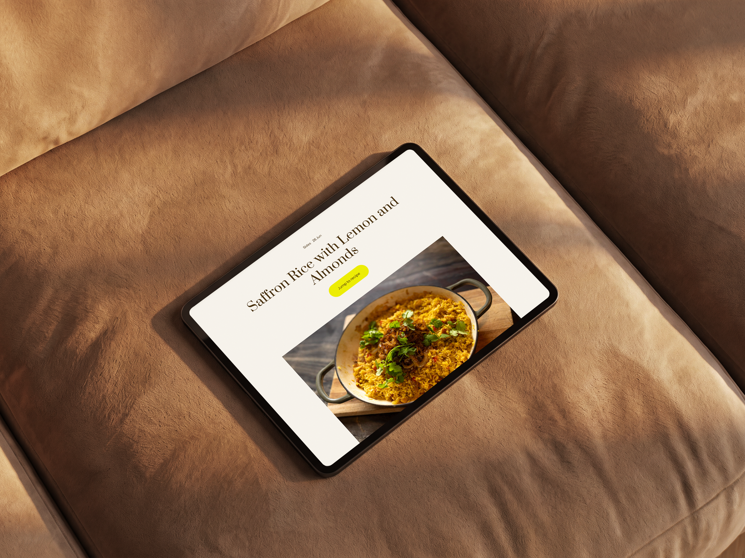
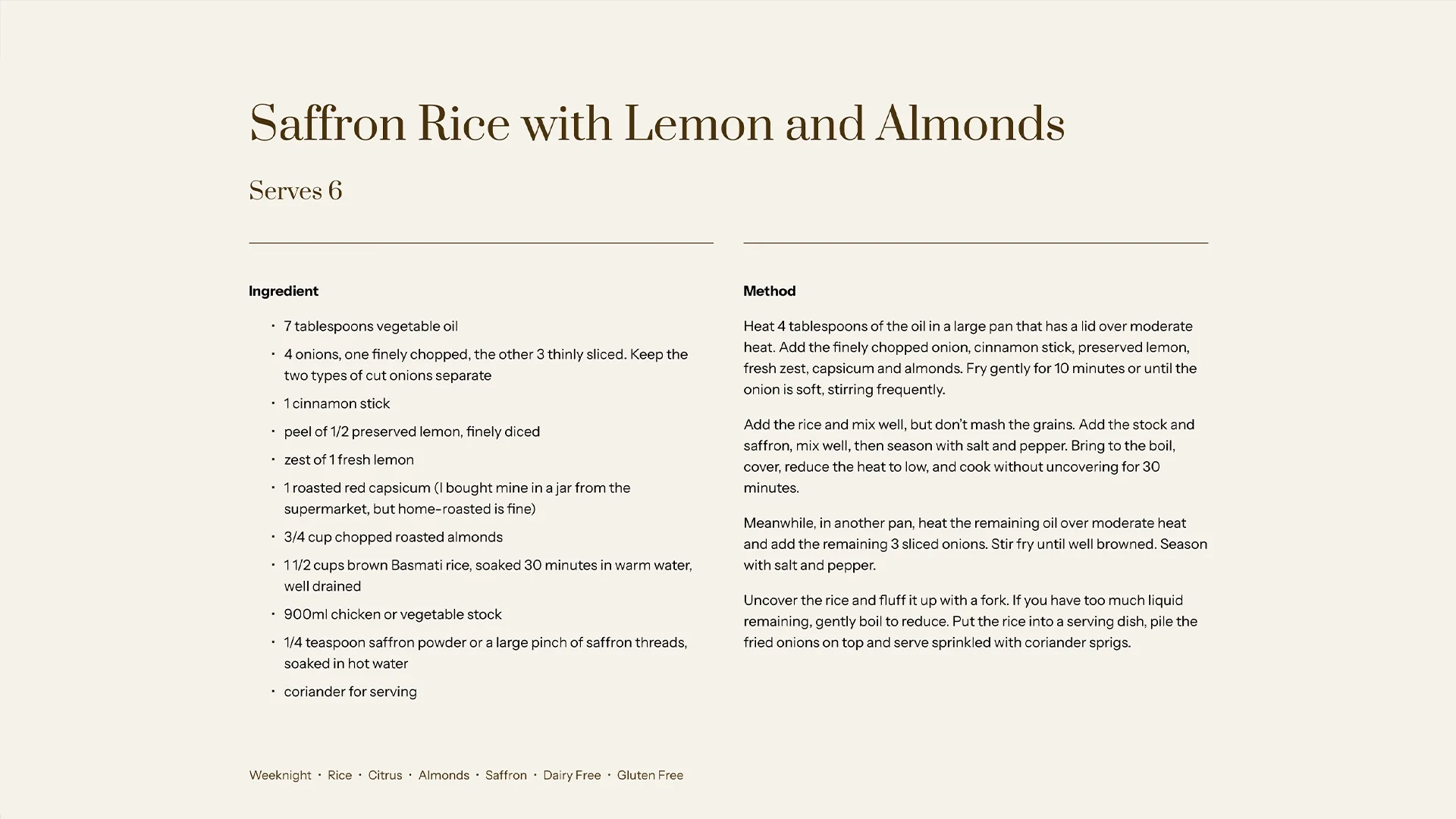
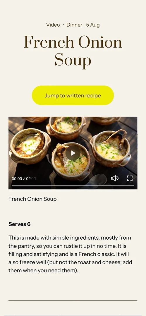
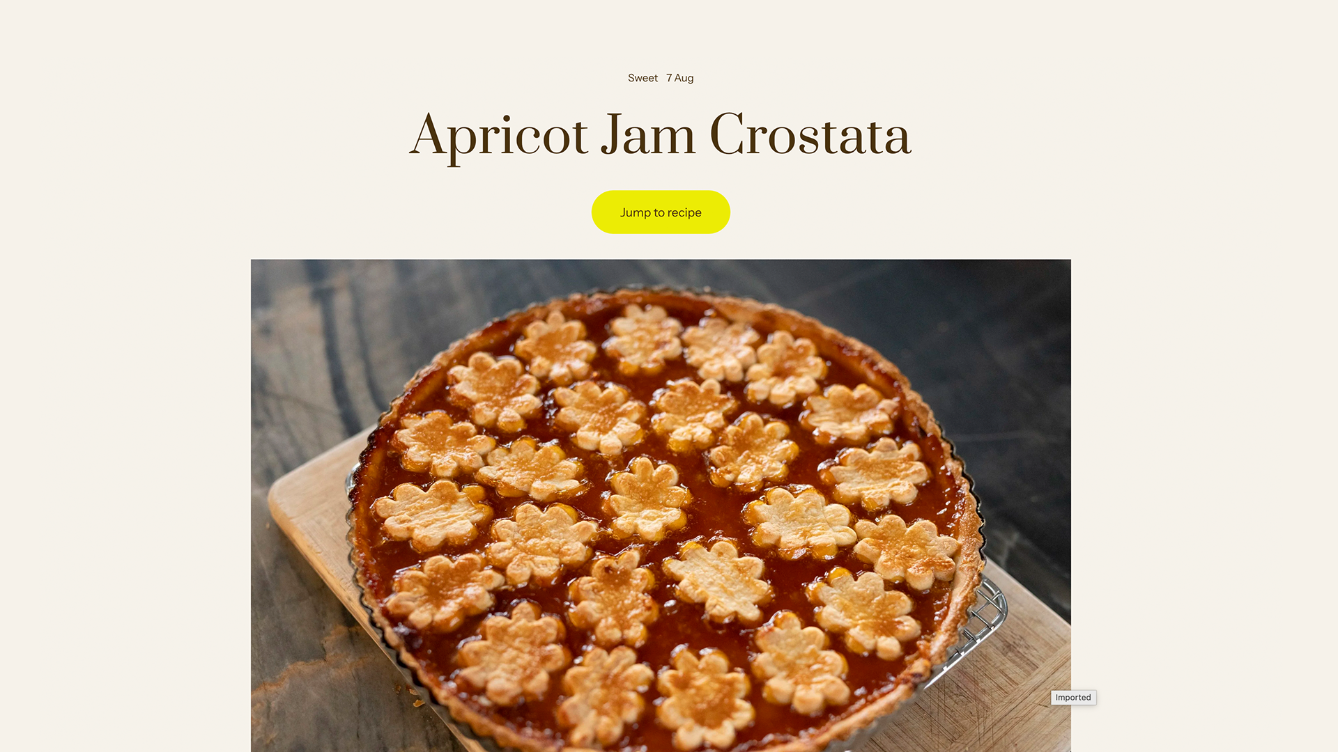
We designed template pages for simple and complex dishes, giving each format room for greater depth without long blocks of text. A 'Jump to recipe' button improves page navigation and brings the site in line with common UI features on other recipe sites.
The result is a site that behaves like a reference tool subscribers can rely on, rather than a feed they have to dig through. Ray now has a structure that rationalises categorisation and prioritises the user experience, keeping the clutter from creeping back in.
-
An ownable visual identity system that provides a consistent and seamles customer experience.
Previous audiences knew Ray McVinnie as a chef, a cookbook author, a food writer and a television presenter — but newer audiences were arriving in droves from social media. The challenge was to create an ownable, recognisable identity that felt like a natural extension of Ray's food and personality, and that could separate his content from Instagram's native styling tools.
We translated the web design system into templates for Instagram, so the aesthetic carries across every channel Ray's audience encounters him on. Templates provide flexibility to keep content fresh and interesting, without relying on generic Instagram styling.
His following comes from disparate sources — previously from years in print and on TV, and now from social media. The visual consistency anchors his identity and by extension, his reputation.